Forms
| Severity | Serious |
|---|---|
| Accessibility Principle | Operable |
| Affected users | Visual, Mobility, Cognitive |
| Success criterion | 3.3 |
Labels
Severity: CriticalSuccess criterion: 3.3.2
Labels describe the purpose and function of form elements; and are critical for users who cannot determine this by looking at the form.
- All form controls, such as text fields, checkboxes, radio buttons, etc., must each have a unique label
- Placeholders must not be used as a substitute for a label; as they are only visible if the field is empty
Expectations
- When: A form field receives the focus
- Then: Reads the label
- And: Reads the input type
<TextInput accessibilityLabel="Enter your email address" />
| VoiceOver | Talkback |
|---|---|
| Enter your email address, edit box, double tap to edit text |
Grouping
For some form controls, such as text fields, the label should not be focusable individually, as it would provide redundant information, but the Text field must provide an accessibilityLabel instead.
<Text
    importantForAccessibility="no"
    accessibilityElementsHidden="true">Enter your email address</Text>
<TextInput accessibilityLabel="Enter your email address" />
If the field is required the accessibility label should not end with an asterisk, but a required message should be provided instead.
<Text
    importantForAccessibility="no"
    accessibilityElementsHidden="true">Enter your email address*</Text>
<TextInput accessibilityLabel="Enter your email address, required" />
Errors
Severity: SeriousSuccess criterion: 3.3.1
If the field has an error, then this should be read as part of the field label/hint itself and should not be focused as an isolated component:
This is because if we keep the information in a separate component, the user won't be aware of the error unless it does swipe to select the next element. Also, some users might forget the error, forcing them to swipe left and right to figure out that.
Expectations
- When: The user focuses a form field with a failed validation
- Then: Reads the field valud
- And: Reads the input type
- And: Reads the validation error
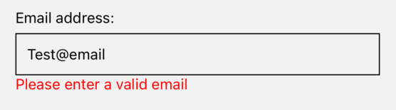
| VoiceOver | Talkback |
|---|---|
| Email address, edit box, please enter a valid email, ... |
Focus on the next field
Severity: SeriousWhen on TextInput, the user should be able to access the next field or submit the form using the specific keyboard button; please don't force them to swipe to do that.
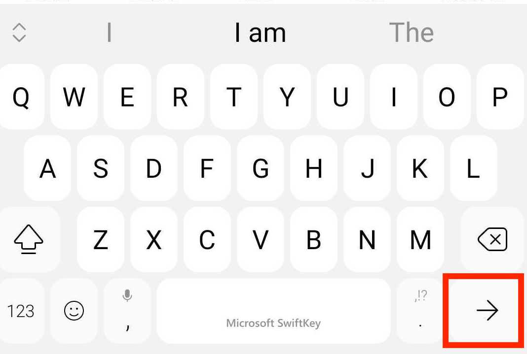
The built-in TextInput automatically handles the returnKeyLabel property and its action.
Keyboard trap
Severity: SeriousThe user must be able to navigate to all the interactive elements on the screen and navigate away from them at any moment without becoming trapped.
For example, if the user decides to navigate away from an input field, it must be allowed to do so; even if the field contains invalid data, it doesn't matter in no way the focus should be programmatically forced back to that field!
Form submission
Severity: SeriousThe user should be able to submit a form using the done button on the keyboard if a text input has it.
Also, an error message should be displayed and autofocused when it fails to let the screen reader know about the issue. Alternatively, the first failed field should be autofocused if no message is available.
AMA dev runtime errors
NO_FORM_LABEL
This error is used when no label has been provided for the TextInput component.
NO_FORM_ERROR
This error is used when no error has been provided for the TextInput component.
NO_KEYBOARD_TRAP
This error is triggered by the TextInput component if the next input field does not have the focus as expected.
This rule cannot be turned off!